| | Essential questions | | How do we recognize the “right” explanation?
How do graphs provide insight into the relationships among variables? | |
|
The accuracy of a scientific theory is often assessed by comparing the predictions of theory with real observational data. For example, if a theory predicts how fast an object’s speed changes, then actual measurements should agree with the theory to within the limits of experimental error. The data provided in the simulation show how some quantities for objects change under different conditions. The examples include an object moving at constant speed, an object dropped from rest, current through a resistor varying with resistance, and an object cooling over time. 
|
Part 1: Matching models to data

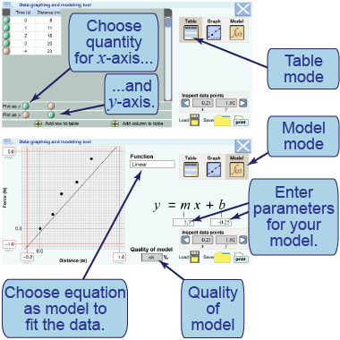
- Plot time on the x-axis by selecting “x” for the column labeled “Time (s).” Plot distance on the y-axis for an object moving at constant speed by selecting “y” for the column labeled “Distance (m).”
- Choose a model equation (line, parabola, exponential, or inverse) to try and fit the data.
- Change parameters for that model to fit the data.
- What model and parameters are a good fit to this distance versus time graph?
- Are equal numbers of data points plotted above and below your model? Why is this important?
- Repeat these steps for a graph of the object dropped from rest using data for height versus time. What model and parameters are a good fit to these data?
- Repeat these steps for a graph of electric current versus resistance using data in the fourth and fifth columns. What model and parameters are a good fit to these data?
- Repeat these steps for a graph of a cooling object using the temperature and time data. What model and parameters are a good fit to these data? Record your results on your assignment sheet.

|
|
In this interactive graphing utility, you will plot data in various x–y graphs and then use models to fit the data. Four different categories of models are included: a straight line; a parabola; an inverse relation; and an exponential function. As your model becomes a good fit to the data, the “score,” or the quality of the model, will increase.
|
Part 2: Other ways to represent data: pie and bar charts

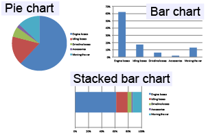
- Use the data below to construct a pie chart, a bar chart, and a stacked bar chart. Be sure to label your charts!
- In the pie chart, how can you tell visually which category uses the most power?
- What is the advantage or disadvantage of representing these data with each of these kinds of charts?
- When would you choose a pie or bar chart to plot data?
- In what cases would you choose a line graph to plot data?
Residential power usage by category | Space heating | Water heating | Lighting | Air conditioning | Refrigeration | Electronics | Washer and
dryer |
|---|
| 32% | 13% | 12% | 11% | 8% | 5% | 5% | 
|
| |
|

