|
A variable is a physical quantity, such as speed or time, that can have a value. In equations, variables are usually named with a single letter, such as v for velocity. In this book, variables are written with italics. When there is more than one variable of the same type, such as two velocities, a subscript is added, such as v1 or v2. An important step in solving physics and engineering problems is to assign unique names to all the important variables! 
|
In an experiment, the experimenter—you!—will often physically change the value of one variable and then measure the resultant change in another variable. The variable you modify or manipulate is called the independent variable, while the variable that changes as a result is the dependent variable. A controlled variable is a quantity that is held constant in an experiment because variations in the quantity could conceivably affect the outcome. 
 |
Sometimes the terminology can be confusing for identifying variables in experiments. An alternate term for the independent variable is the experimental variable, which is the quantity that you vary directly when conducting the experiment. Several alternate terms for the dependent variable are the response variable, responding variable, or the outcome variable. 
|
Graphs of data show patterns that are often hard to see in a data table. Throughout this course, we will use graphs of motion, waves, frequencies, and many other variables to demonstrate patterns. Computers are particularly useful at drawing graphs and other representations of data quickly. The tool we will use most is the x–y graph. 
|
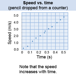
 An x–y graph is a visual representation of the relationship between two variables. Just as words are spelled a certain way, graphs are drawn by following certain rules. In the graph on the right, a student drops a pencil from counter height and measures its speed (the dependent variable) as a function of time (the independent variable). The independent variable (time) goes on the horizontal or x-axis, and the dependent variable (speed) goes on the vertical or y-axis. The graph shows a pattern of speed increasing with time. The mass and size of the pencil are controlled variables, because changing them might affect the measured speed.
|
Graphs have a scale on both the x and y axes. The scale tells you the relationship between changes on the graph and changes in the variable itself. Be careful when interpreting graphs! A large visual change can sometimes mean only a small real change depending on the scale of the graph. The two graphs below show the same data. One looks like a big change whereas the other does not! The only difference between the two graphs is the scale of the y-axis. 
|

|
Georgia measures the air temperature at noon every day for an entire year. If she wants to graph her findings, which is the independent variable and which is the dependent variable?
 |
The day of the year is the independent variable and so should go on the x–axis. The air temperature is the dependent variable and should go on the y–axis. 
|

